
When you first log into SystemView, you’ll land on the Explore page. From here, you can navigate across different domains, open components, apply filters, and interact with tiles. This article gives you a quick orientation to the general layout and how to navigate confidently across the platform.
In this article:
- General interface overview
- Navigating Explore
- Understanding the component page layout
- Navigating Interact
- Walkthrough guide
General interface overview

- Area Buttons: Switch between Explore, Interact, and any other environments available to your organisation (e.g., JurisdictionView).
- Notifications, Sharing & Account Settings: Access your alerts, view content shared with you (such as MyHubs, SharedLists, and SharedProjects), and open your account settings (including log out options).
- Announcement Banners: If there are known issues, upcoming updates, or messages from your SystemView admin team, they’ll appear here.
- Zoom & Alignment: Adjust how the daisy chain is displayed when you're in Explore.
- Help & Support: Access onboarding guides, eLearning modules, and video walkthroughs.
Navigating Explore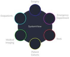
Explore is your main environment for viewing data. It uses the daisy chain layout to guide you through domains, component groups, and individual components.
🔗 See: What is Explore? › and What is the daisy chain ›

-
Select a Domain
Choose a domain from the daisy chain (e.g., Outpatients, Surgery, Beds). This will open the component groups available within that domain.
-
Select a Component Group
Within the domains daisy chain, click on any component group to reveal its available components.
-
Open a Component
Click on the component you want to view. This opens its dashboard page, where you can filter, drill down, and explore the data further.
Understanding the component page layout
Each component page gives you a consistent set of tools and information:

- Breadcrumbs
 Displayed at the top-left, these show your path and let you jump back to a previous step in Explore
🔗 See: How do I go back to the previous screen in Explore? › - Data Refresh Time
 Also at the top-left, this shows when the data for the component was last updated.
 - Filter Bar
 Located at the top-left of the component page, below the data refresh time. Use this to drill into data by site, specialty, and more.
🔗 See: How do I use filters? ›
- Chart Series Toggle
 Below most charts, you’ll find clickable legends. Click on a label to isolate that series in the chart.
 - Activate
 Click the purple Activate button in the top-right of a tile to open it in full screen. This unlocks options to export, share, add to a MyList/MyProject/MyHub, or set a Monitor Goal or Improvement Target.
🔗 See: What does the purple Activate button do? ›
 Navigating Interact: Your personal workspace
While Explore is for discovering data, Interact is your personalised environment for saving, grouping, and tracking what’s important to you.
🔗 See: What is Interact? ›
You'll find:
- 🔗 MyView: A dashboard of tiles you've chosen to watch, monitor, or improve.
- 🔗 MyLists / SharedLists: Save and share patient-level data tables.
- 🔗 MyProjects / SharedProjects: Group charts together for improvement work or reports.
- 🔗 MyHub: Build your own dashboard with key charts and tables from any component in SystemView.
Take a quick tour
View the interactive guide below to learn how to navigate domains, open components, and use key features in SystemView.