
Location in SystemView: SystemView > Explore > Emergency Department > Flow Monitor > Live Patient Flow
In this article:
What it is
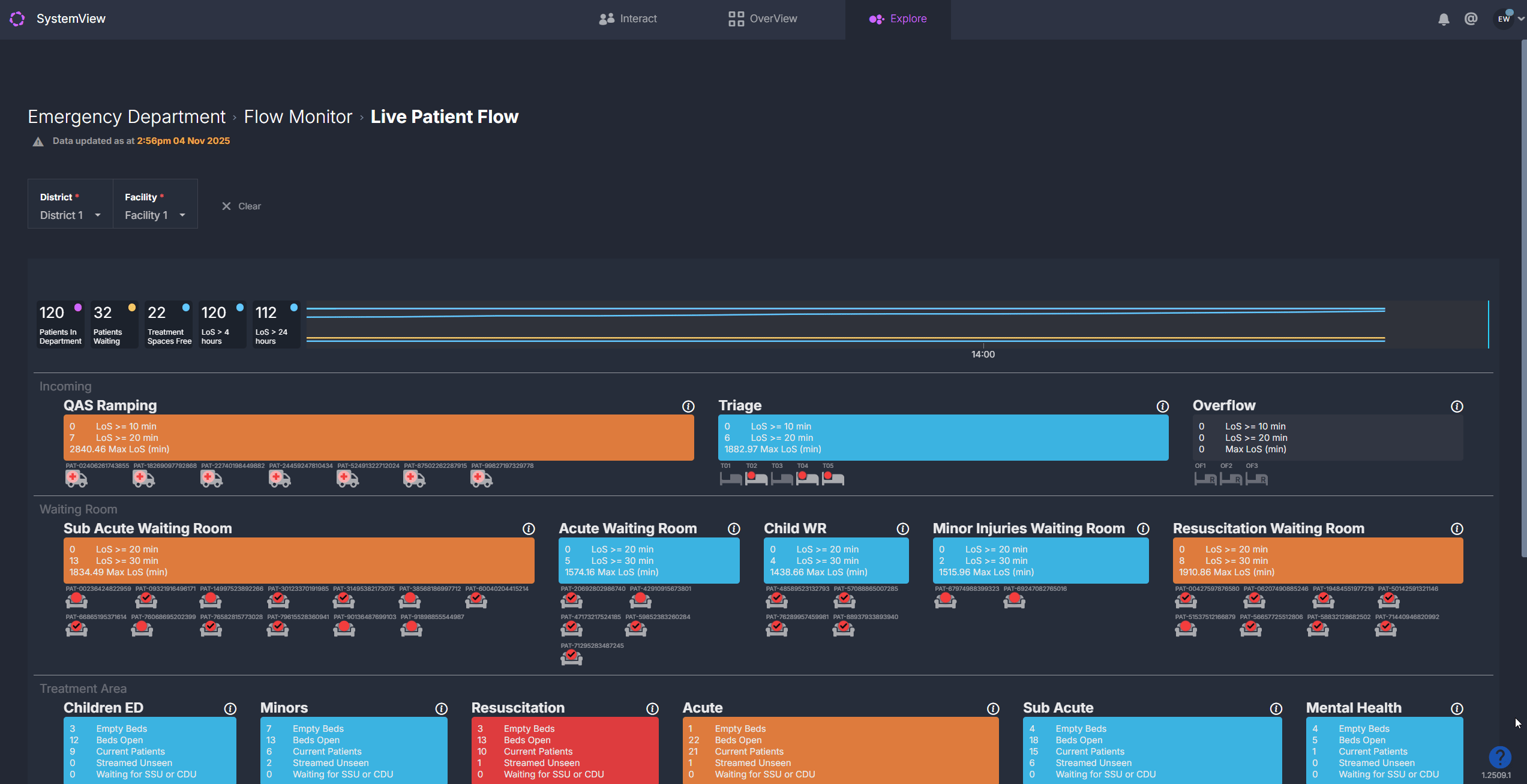
The Live Patient Flow component provides a live visualisation of patient movement and occupancy across the Emergency Department (ED). It acts as a dynamic, map-based overview showing where every patient is located, their current status, and any clinical or operational risks that may require escalation.
Why it matters
Your command centre view of the ED.
- Instantly identify patient and area-level pressure points
- Spot patients approaching clinical or performance thresholds
- Support timely decision-making during huddles and handovers
- Coordinate actions across zones using shared visual context
How to use it
Navigating the map
The Live Patient Flow map presents the ED as a bird’s-eye layout, segmented into zones such as:
- Ramping
- Waiting areas
- Treatment spaces
- Short Stay / Inpatient zones
Each area and patient on the map is represented by colour-coded indicators that refresh every few minutes to reflect the latest activity in the department.
These colours help you instantly recognise where pressure is building and which patients may need escalation or review.
Area colours – occupancy and pressure levels
The background colour of each ED zone shows how busy that area currently is:
| Colour | Meaning | How to interpret |
| Blue | Low activity | Patient numbers and bed usage are well within capacity. |
| Orange | Moderate activity | The area is becoming busier - monitor for early signs of congestion. |
| Red | High demand | The area is nearing or at full capacity and may require escalation or redistribution of patients. |
Patient colours – total length of stay (LoS)
Each patient in the treatment spaces are shown as a coloured dot on the map. The colour indicates how long they’ve been in the ED and whether they’re approaching or have exceeded key performance thresholds:
| Colour | Length of Stay | What it signals |
| Blue | < 3 hours | Patient is within the target length of stay timeframe. |
| Orange | 3 - 4 hours | Patient is approaching the 4-hour length of stay KPI and may need review to avoid breach. |
| Red | > 4 hours | Patient has exceeded the 4-hour length of stay KPI and is considered as a breach. |
| Flashing Red | > 8 hours | Patient is considered stranded - a high clinical and operational risk requiring urgent attention. |
ℹ️ Note: These colours apply to patients who have already been seen and are in treatment or observation areas.
Patients who are waiting to be seen are instead colour coded by their triage category based on the time since arrival and their target review timeframe.
A tick on a patient dot in the waiting areas indicates that the patient has been seen.
Explore area details
Clicking on any zone within the map (such as Waiting, Acute, or Short Stay) opens a detailed view for that specific area.
This allows you to explore patient-level information and understand what’s contributing to local pressure or escalation.
Each area view includes several tables that show:
- Incoming patients: Those allocated to that area but not yet arrived or assigned a bed.
- Current patients: All patients currently occupying a bed or space within that area, including key details such as triage, treating clinician, and total time in ED.
- Patients waiting for subspecialty review: Those who have been referred to a specialist team and are waiting to be reviewed before discharge or admission.
- Patients waiting for admission: Patients medically ready to leave ED but waiting on an inpatient bed allocation.
You can sort or export these tables for further analysis if required, helping teams quickly identify bottlenecks within specific areas.
Top summary bar
![]() The summary bar at the top of the map provides key ED metrics refreshed in near real-time:
The summary bar at the top of the map provides key ED metrics refreshed in near real-time:
- Total patients currently in the ED
- Patients waiting to be seen
- Available treatment spaces
- Patients with LoS >4 hrs
- Patients with LoS >24 hrs
This gives staff a quick, reliable overview of department pressure and performance at any given time.
How it works
The Live Patient Flow component applies a set of patient-level and area-level escalation rules that determine the colours you see on the map.
These rules help SystemView identify when patients or zones are approaching clinical or operational risk thresholds and automatically update their colour status as conditions change.
Patient-level logic
SystemView continuously evaluates each patient’s journey through the ED to highlight time-based risks:
- Length of stay (LoS): Patients in treatment areas transition from blue to orange to red and finally flashing red as they move beyond the 3-, 4-, and 8-hour thresholds.
- Triage category: Patients in waiting areas are also colour-coded by how long they have been waiting compared to their triage target time. As they approach or exceed their category-specific time-to-review KPI, their colour transitions from blue to orange to red, signalling that clinical review is due or overdue.
These rules make it easy to spot which patients are within target timeframes and which are at risk of breaching key performance indicators.
Area-level logic
Each ED zone is also monitored for occupancy and workload pressure:
- Waiting areas: Escalate based on the total number of patients waiting.
- Acute and Resuscitation areas: Escalate based on the percentage of beds occupied, with additional alerts when multiple resuscitations are underway.
- Colour progression: Areas shift from blue (low activity) to orange (moderate) to red (high demand) as occupancy or workload increases.
Together, these escalation rules allow SystemView to present a live picture of ED flow and identify when specific areas or patients may require action.
How it helps you
- Identify bottlenecks instantly: Colour-coded zones highlight pressure points as they emerge.
- Support escalation processes: Patient and area-level rules standardise response triggers.
- Improve situational awareness: Everyone sees the same, current picture of the ED.
- Enhance coordination: Use it during huddles, handovers and command-centre reviews.
- Monitor performance: Track breach risks and resourcing needs at a glance.
Best practices
How often should I use it?
| What to Do | How Often | Who Should Do It | Why It Helps |
|---|---|---|---|
| Review ED occupancy and patient flow | Continuously throughout shifts |
Nurse in Charge, Flow Coordinator | Enables early intervention and balanced workload |
| Use during huddles and handovers | Start/end of shift | ED Clinical Teams | Promotes shared understanding of pressure points |
| Review escalated areas | Hourly | Operations Manager, Clinical Leads/Execs | Maintains oversight for command-centre reporting |
Pair with these components
- 🔗 Department Now > Situation Report: View near real-time wait and occupancy metrics alongside the live patient flow map.
- 🔗 Flow Monitor > Recent Patient Flow: Review flow and escalation patterns from the last shift.
- 🔗 Flow Monitor > Historical Patient Flow: Analyse 24-hour trends to identify recurring bottlenecks for any day in the past three months.
Tips for success
- Hover over patient dots to view triage and timing details.
- Use colour patterns to prioritise escalation actions.
- Integrate the Live Patient Flow view into ED command-centre dashboards in Interact › for at-a-glance monitoring.
- Review stranded patients (>8 hrs) regularly to identify discharge or admission delays.
Want a detailed breakdown?
If you’d like a more detailed look at every filter, chart, and tile in this component, you can download the Live Patient Flow Guide below.
📎 Download: Emergency Department > Flow Monitor > Live Patient Flow Guide