
Location in SystemView: SystemView > Explore > Emergency Department > Flow Monitor > Historical Patient Flow
In this article:
What it is
The Historical Patient Flow component enables detailed playback and analysis of how patients moved through the Emergency Department (ED) on any selected day within the past three months.
It provides the same interactive, map-based view as the Live Patient Flow › component, showing all patient locations, area occupancy, and escalation events, but allows you to revisit and replay what the department looked like at any point in time.
Why it matters
Look back and see how your ED was functioning at any point in the past three months.
- Review patient flow and congestion patterns for previous shifts or days.
- Investigate incidents, complaints, or peak-demand periods with visual context.
- Replay patient movements and area escalations to identify operational bottlenecks.
- Support performance reviews, audits, and clinical governance investigations.
How to use it
Selecting a date
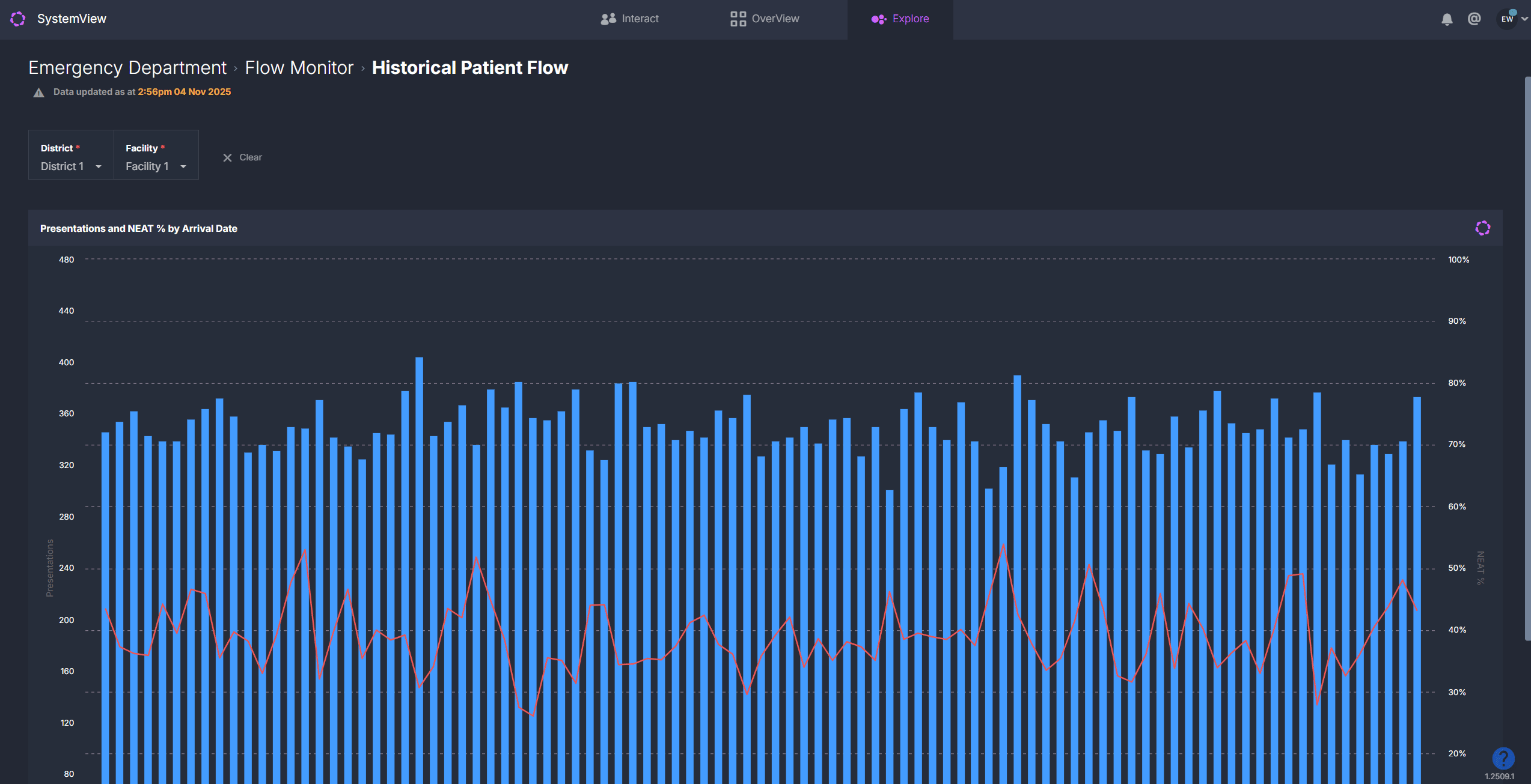
 When you first open the component, you will see a chart of daily ED presentations and the ED Length of Stay (ELOS) % or NEAT % for the past three months, depending on your local environment. Both measures reflect the 4-hour performance target for emergency departments.
Click on any day in this chart to load the full historical flow visualisation for that 24-hour period.
This opens the same interactive map used in Live Patient Flow ›, displaying all patient dots and area zones exactly as they appeared at each point on that day.
Navigating the map
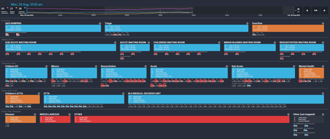
Once a date is selected, the map displays the department as it was configured on that day, divided into zones such as:
- Ramping
- Waiting areas
- Treatment spaces
- Short Stay / Inpatient zones
Each patient and area is colour coded based on the same escalation rules used in the Live Patient Flow › component.
Area colours – occupancy and demand
| Colour | Meaning | How to interpret |
| Blue | Low activity | Patient numbers and bed usage are well within capacity. |
| Orange | Moderate activity | The area is becoming busier - monitor for early signs of congestion. |
| Red | High demand | The area is nearing or at full capacity and may require escalation or redistribution of patients. |
Patient colours – total length of stay (LoS)
| Colour | Length of Stay | What it signals |
| Blue | < 3 hours | Patient was within the target LoS timeframe. |
| Orange | 3 - 4 hours | Patient approaching 4-hour LoS KPI. |
| Red | > 4 hours | Patient breached 4-hour LoS KPI. |
| Flashing Red | > 8 hours | Stranded patient, a high clinical risk requiring escalation. |
ℹ️ Note: These colours apply to patients who have already been seen and are in treatment or observation areas.
Patients who are waiting to be seen are instead colour coded by their triage category based on the time since arrival and their target review timeframe.
A tick on a patient dot in the waiting areas indicates that the patient has been seen.
Exploring patient and area details
Clicking on any zone within the map, such as Waiting, Acute, or Short Stay, opens a detailed view for that area.
Here you can review all patient-level information for that 24-hour period, including:
- Incoming patients for the area
- Patients who occupied that area during the selected day
- Patients waiting for subspecialty review
- Patients waiting for admission
These tables mirror those in Live Patient Flow › and can also be exported for further analysis.
Playback controls
![]()
At the top of the map, a timeline bar runs from midnight to midnight for the selected date.
Use the playback controls to step through or replay all patient and area movements throughout that 24-hour period.
| Control | Function |
| ▶️ Play / Pause | Starts or stops the playback of patient and area movements. |
| ⏪ Rewind 10 mins | Steps the playback back by 10 minutes |
| ⏩ Fast forward 10 mins | Jumps the playback forward by 10 minutes. |
| ⏭️ Playback speed | Toggles playback speed (1x, 2x, 5x, 10x). |
| ⏱️ Timeline scrub | Click or drag along the timeline to move directly to any point in the day. |
As playback runs, you will see the map update dynamically with patients arriving, being seen, moving between areas, and discharged, along with occupancy and escalation changes in each area.
Top summary bar
![]()
At the top of the component, key statistics for the selected timepoint are displayed and update as playback progresses:
- Total patients in the department
- Patients waiting
- Treatment spaces free
These metrics track how activity changed over the course of the selected day.
How it works
Historical Patient Flow uses the same escalation rules and colour logic as Live Patient Flow › to visualise clinical and operational risk.
Instead of displaying current activity, it replays the recorded state of the department for the chosen day.
Patient-level logic
SystemView evaluates each patient’s length of stay and triage timing to highlight time-based risks:
- Length of stay (LoS): Patients transition from blue to orange to red and flashing red as they exceed 3-, 4-, and 8-hour thresholds.
- Triage category: Patients in waiting areas are colour coded by their triage target time. As they approach or exceed their category-specific time-to-review KPI, their colour transitions from blue to orange to red, signalling that clinical review is due or overdue.
Area-level logic
Each ED zone is assessed against defined occupancy and activity thresholds:
- Waiting areas: Escalate as total waiting patients increase.
- Acute and Resuscitation areas: Escalate based on bed availability, occupancy percentage, and the number of concurrent resuscitations.
- Colour progression: Blue → Orange → Red to indicate rising pressure.
This consistent logic allows for accurate comparisons between historical and live conditions, helping teams understand what was occurring in the department at any moment.
How it helps you
- Investigate retrospectively: Revisit any 24-hour period to understand what was happening in the department at that time.
- Support governance and incident reviews: Visualise patient flow and congestion during reported events.
- Identify recurring bottlenecks: Compare busy periods and see how escalation thresholds were triggered.
- Enhance operational learning: Use playback during performance reviews or debriefs to inform process improvement.
Best practices
When to use it
| What to Do | Who Should Do It | Why It Helps |
|---|---|---|
| Reviewing a clinical incident or complaint | ED Director, Nurse in Charge | See the real flow and demand at the time of incidents. |
| Analysing performance on a busy day | Operations Managers, Analysts | Understand contributing factors to 4-hour target breaches. |
| Shift handover review | Clinical Teams | Replay the previous shift for shared situational awareness. |
Pair with these components
- 🔗 Flow Monitor > Live Patient Flow: Monitor the current state alongside historical trends.
- 🔗 Flow Monitor > Recent Patient Flow: Review patient and area movement for the previous days shifts.
- 🔗 Trends > Demand & Activity: Compare historical flow with arrival volumes and ELOS/NEAT performance.
- 🔗 Department Now > Situation Report: Review daily performance metrics next to historical playback.
Tips for success
- Use playback speed to move quickly through quieter periods.
- Hover over patient dots to review triage details and total time in ED.
- Export area tables for patient lists relevant to specific escalation points.
- Combine Historical and Live views for continuous monitoring and review cycles.
Want a detailed breakdown?
If you’d like a more detailed look at every filter, chart, and tile in this component, you can download the Historical Patient Flow Guide below.
📎 Download: Emergency Department > Flow Monitor > Historical Patient Flow Guide