
Location in SystemView: SystemView > Explore > Emergency Department > Trends > Demand & Activity
In this article:
What it is
The Demand & Activity component provides a historical view of Emergency Department (ED) performance, including patient arrivals, breaches, and overall flow. It allows you to review what occurred in the ED on any given day and understand the factors driving performance trends.
When opened, the component first presents high-level trend charts covering up to 13 months of data. Selecting any day in these charts drills into a detailed view of that 24-hour period, revealing hourly arrivals, occupancy, breaches, and patient mix.
Why it matters
Turn hindsight into foresight.
- See demand in context: Compare daily arrivals to expected volumes and identify anomalies.
- Spot patterns in performance: Track NEAT/PET/ELOS compliance trends and uncover pressure points.
- Investigate escalation events: Review what happened during busy days, surges, or special events.
- Support planning and improvement: Use historical flow data to inform rostering, bed allocation, and access planning.
How to use it
Filter to focus your view
You can filter the data to refine your analysis:
- Area Type: switch between Main ED or Other mapped areas within the emergency department.
- Age Group: filter by Adult, Paediatric, or Mixed EDs.
- Admission Status: focus on admitted or non-admitted presentations.
- NEAT / PET / ELOS Status: show all, compliant, or breached cases.
ℹ️ Note: NEAT, PET, and ELOS are equivalent metrics that measure Emergency Department length of stay. The terminology displayed in your SystemView environment will reflect your local jurisdiction and targets:
- NEAT % = National Emergency Access Target (4-hour target)
- ELOS % = ED Length of Stay (4-hour target)
- PET % = Patient Experience Time (6-hour target
Explore demand and performance trends
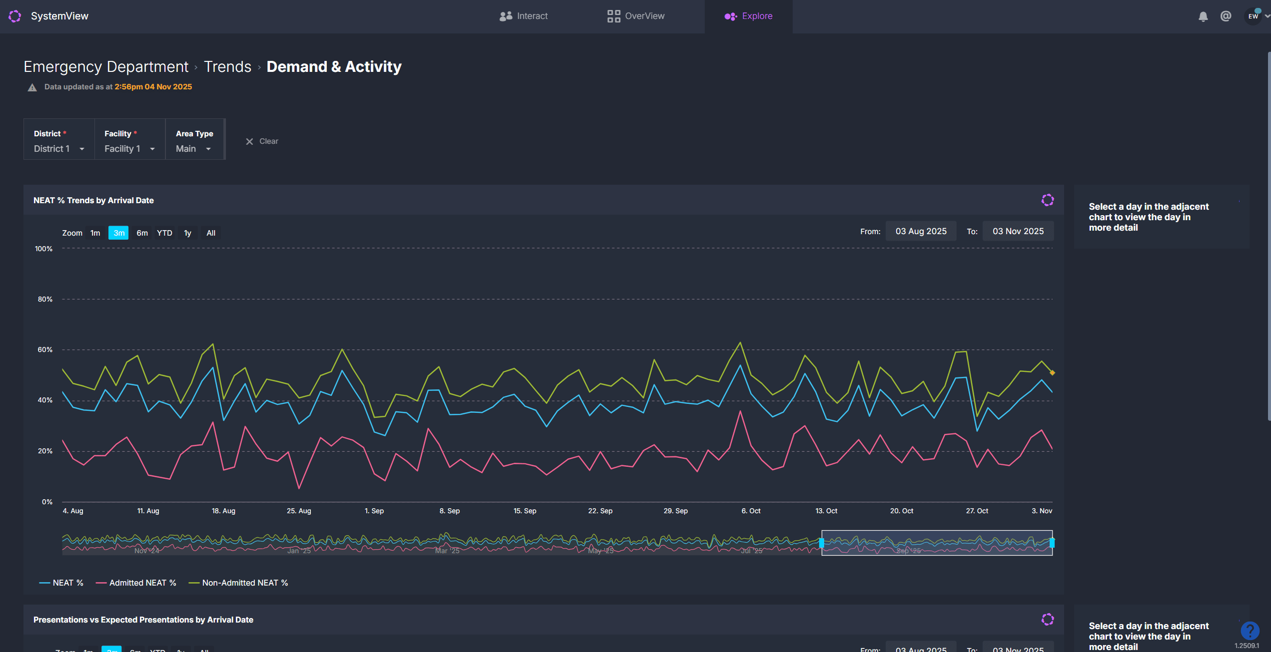
When you open this component, you will see trend charts summarising performance and activity over time.
| Chart name | What it shows |
| NEAT / PET / ELOS % Trends by Arrival Date | Percentage of patients admitted, discharged, or transferred within target time. Shows overall, admitted, and non-admitted cohorts. |
| Presentations vs Expected Presentations by Arrival Date | Compares actual daily arrivals (blue bars) with expected arrivals (grey line) based on historical patterns. |
| Waiting for Admission Trend / Previous Year (available in some SystemView environments) | Tracks daily number of patients awaiting inpatient admission, allowing year-on-year comparison of access block. |
💡 Tip: Click any date in the trend charts to view the full 24-hour breakdown for that day.
View a single day’s activity
Clicking a day in any trend chart opens a detailed daily analysis showing what happened in the ED during that 24-hour period.
| Tile name | What it shows |
| Summary Metrics | Total presentations, maximum length of stay, and daily breach counts |
| Presentations by Arrival Hour | Displays hourly arrivals vs expected arrivals to highlight surges and quiet periods. |
| Patients in ED by Pathway & Time | Number of patients in ED throughout the day, plotted against escalation thresholds. |
| Breaches by Hour of Breach | Hourly NEAT, PET, or ELOS breaches to identify when targets were missed. |
| Waiting ED Patients by Wait Type | Number of patients waiting for review, admission, or to be seen over time. |
| Arrivals by Triage Category | Displays the number of presentations by triage category for the selected date to show the acuity mix and clinical demand. |
| Patients by Diagnosis and NEAT / ELOS / PET Status | Displays the number of presentations for the selected date by diagnosis. Patients that breached the 4- or 6-hour length of stay target are coloured red. |
| Discharges vs Required by Discharge Hour | Shows whether discharges kept pace with arrivals throughout the day. |
| Cumulative Discharges vs Cumulative Required Discharges to Maintain Flow | Tracks cumulative departures vs what was needed to sustain flow, showing positive or negative balance. |
| Total Patients by Length of Stay (excl. SSU) | Visualises patient counts by length-of-stay band to highlight long-stayers |
ℹ️ Note: Some SystemView environments may not include the discharge-related or length-of-stay charts.
Explore patient details
 Select the Patients button at the top of the detailed daily view to open patient-level information for the selected date.
This displays three interactive tables that provide insight into individual episodes of care and subspecialty activity:
- Episode of Care Summary: lists all patient presentations for the day, including demographics, triage category, diagnosis, and total length of stay.
- Subspecialty Review Summary: shows patients who had a consult order with the time waiting for subspecialty review and the specialty responsible for review.
- Patient Location History: outlines the time spent by each patient in specific ED areas and their total time in the department.
Use these lists to support retrospective audits, clinical incident reviews, or escalation analysis. Data in these tables can be exported for further analysis. See How to export from SystemView ›.
💡 Tip: To return to the main trends view, use the Clear Filters and Return button at the top of the page.
How it works
The component aggregates 12–15 months of historical ED data to analyse performance trends and compare expected versus actual demand.
Calculation logic
- Expected presentations: derived from the average number of arrivals for the same day of week, hour, and season (for example, summer or winter) over the previous 2 years.
- NEAT / ELOS / PET %: percentage of patients admitted, discharged, or transferred within the 4- or 6-hour target.
- Required discharges: number of departures needed each hour to offset the previous hour’s arrivals and maintain flow.
How it helps you
- Identify demand spikes: Quickly see when and why volumes exceeded expectations.
- Diagnose bottlenecks: Link occupancy peaks with breaches or low discharge rates.
- Plan smarter rosters: Match staffing and escalation levels to historical busy hours.
- Support improvement initiatives: Track how process or layout changes impact flow.
- Collaborate effectively: Share insights with inpatient and operations teams to balance demand and capacity.
Best practices
How often should I use it?
| What to Do | How Often | Who Should Do It | Why It Helps |
|---|---|---|---|
| Review daily performance trends | Weekly |
ED Nurse Unit Managers, Flow Coordinators | Identify recent surge patterns or breach clusters. |
| Analyse seasonal variation | Quarterly | Operations Leads, Executives | Support resourcing and access planning. |
| Drill into specific incident days | As needed | Service Improvement, Data Analysts | Conduct root-cause analysis of breaches or overcrowding. |
Pair with these components
- 🔗 NEAT / ELOS / PET Analysis: review compliance in detail and identify which presentations contributed to breaches or performance shifts seen in Demand & Activity.
- 🔗 Flow Monitor > Historical Patient Flow: understand how patient flow and inpatient admissions influenced ED congestion on high-demand days.
- 🔗 Trends > Subspecialty Reviews: assess whether delays in subspecialty reviews or inpatient handovers contributed to prolonged stays or breaches.
Tips for success
- Review trend-level data first, then click through to specific days to understand what drove performance changes.
- Compare spikes in presentations with breach times and occupancy peaks to identify resourcing gaps.
- Use expected presentations as a benchmark to spot special events or emerging system pressures.
- Check the Historical Patient Flow › component to see whether congestion was caused by inpatient discharge delays or access block.
- Export › patient-level tables to support structured audits, escalation reviews, or service improvement planning.
Want a detailed breakdown?
If you’d like a more detailed look at every filter, chart, and tile in this component, you can download the Emergency Department Demand & Activity Trends Guide below.
📎 Download: Emergency Department > Trends > Demand & Activity Guide
❓FAQs
Q. Why do I see PET instead of NEAT or ELOS?
A. Different environments use different terminology and targets, but they all measure the same ED length-of-stay performance depending on local jurisdiction.
Q. Why are some discharge charts missing in my environment?
A. Not all jurisdictions have implemented the new discharge-flow charts yet. They will appear automatically once available for your site.
Q. Can I change the expected presentations logic?
A. No. Expected presentations are automatically calculated from historical data patterns and refreshed daily.