
Location in SystemView: SystemView > Explore > Emergency Department > NEAT / ELOS / PET Analysis
In this article:
What it is
This component analyses Emergency Department (ED) performance against access-time targets, measuring how many patients are admitted, discharged, or transferred within a set timeframe.
💡 Note: Depending on your environment, it may appear as:
-
NEAT Analysis: National Emergency Access Target, 4-hour target
-
ELOS Analysis: Emergency Department Length of Stay, 4-hour target
-
PET Analysis: Patient Experience Time, 6-hour target
NEAT, PET, and ELOS are equivalent metrics that measure Emergency Department length of stay. The terminology displayed in your SystemView environment will reflect your local jurisdiction and targets.
Despite naming differences, the logic and structure remain consistent across all environments.
Why it matters
Visualise time-based access performance and identify bottlenecks affecting patient flow.
- Understand how well your ED is meeting its access target.
- Pinpoint when and where breaches occur.
- Analyse differences between admitted and non-admitted patients.
- Explore demand variation against expected presentations.
- Identify escalation periods to support planning and coordination.
How to use it
Filter to focus your view
Use the filter bar to narrow your analysis:
- Admitting Team: Focus on specific inpatient admitting teams.
- Admission Status: View all presentations or filter to Admitted or Not Admitted only.
- Area Type: Choose All, Main or Other mapped ED areas.
Explore key performance metrics
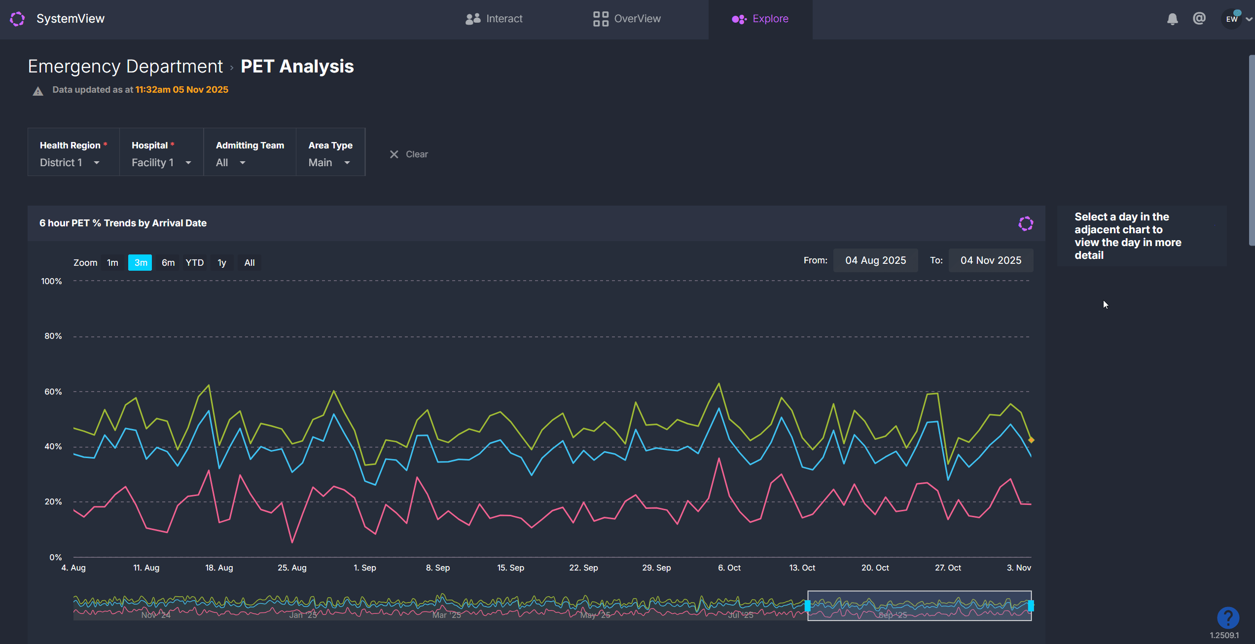
When you first open the component, you will see a 13-month overview of access time performance.
Clicking on any day within a trendline opens a detailed daily breakdown for that date.
ℹ️ Definitions: Admitted and non-admitted groups are displayed separately in several charts to help you understand how performance differs between admitted and non-admitted patients.
- Admitted presentations are patients who were admitted to an inpatient ward from the ED.
- Non-admitted presentations are patients who were discharged home, transferred to another facility or left without being admitted.
| Chart name | What it shows |
| NEAT / PET / ELOS % Trends by Arrival Date | Trendlines showing the percentage of ED presentations admitted, discharged or transferred within the target time, based on arrival date. |
| NEAT / ELOS % Trends by Discharge Date* | Trendlines showing the percentage of ED presentations meeting the target time, based on discharge date. This helps assess the impact of patients who arrived earlier but discharged later. (Not available in PET environments.) |
| Additional timeframe charts | Variants showing performance within 1.5 hr, 4 hr, 6 hr, 9 hr and 24 hr timeframes, and over-75 patient cohorts to highlight performance for specific groups. |
Adjust your timeframe
Use the Zoom buttons at the top of the chart to quickly view a 1-month, 3-month, 6-month, year-to-date or full-year period. You can then:
- Move through time: Drag the scroll bar at the bottom of the chart left or right to shift the selected period backward or forward.
- Resize your view: Click and drag the edges of the scroll bar to expand or narrow the timeframe and focus on a larger or more specific date range.
- Select custom dates: Click the From and To date fields at the top of the chart to choose any date range from the past 13 months, such as a specific week, fortnight or known period of high activity.
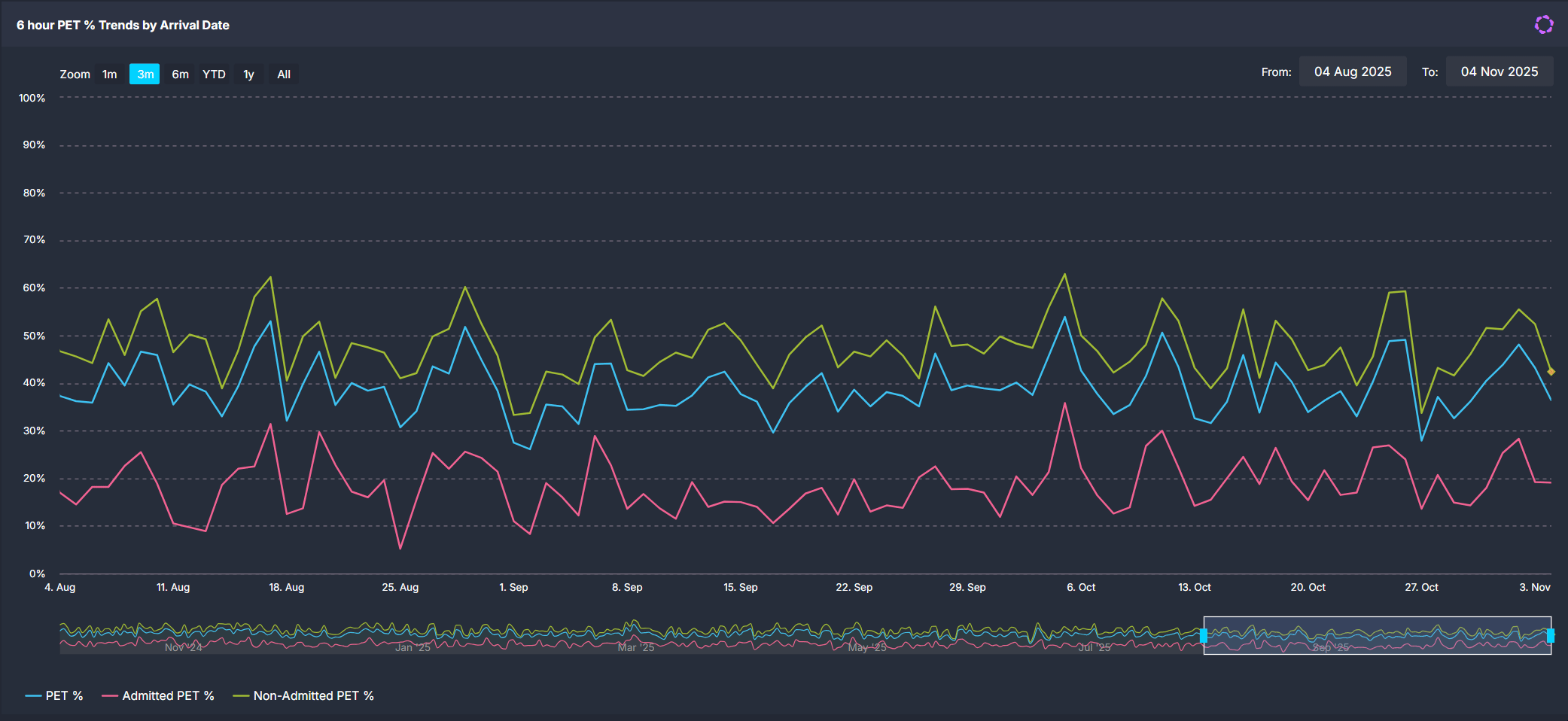
💡 Tip: Combine zoom, scroll and custom date selection to focus on any timeframe that best suits your analysis.
Daily breakdown view
Click any date in the overview charts to open detailed metrics for that day.
| Tile name | What it shows |
| Summary – NEAT / ELOS / PET % | Displays the percentage of presentations that were admitted, discharged or transferred (non-admitted) within the target timeframe. |
| Breaches by Hour of Breach | Shows the number of presentations exceeding the target time, tallied by the hour when the breach occurred. |
| Patients in ED by Pathway & Time | Displays the number of patients in the ED at 30-minute intervals, colour-coded by area, with an overlay showing escalation triggers. |
| Summary – Presentations vs Expected | Displays the number of presentations for that day, along with the expected presentations, maximum length of stay and hours where presentations exceeded expected volumes. |
| Presentations by Arrival Hour | Compares actual hourly arrivals against expected, upper control (top 15.9% busiest days) and lower control (bottom 15.9%) limits. Hours with presentations that breached the upper control line are highlighted in pink. |
| Waiting ED Patients by Wait Type & Time | Shows the number of patients waiting for review, subspecialty review or admission at 30-minute intervals. |
| NEAT / ELOS / PET by Admitting Team | Displays the number of inpatient admissions by team, with breaches coloured red. |
| Patients by Diagnosis & NEAT / ELOS / PET Status | Displays presentations by diagnosis or presenting complaint showing the proportion of breached versus in-time cases. |
Explore patient details
 Select the Patients button at the top of the detailed daily view to open patient-level information for the selected date.
This displays three interactive tables that provide insight into individual episodes of care and subspecialty activity:
- Episode of Care Summary: lists all patient presentations for the day, including demographics, triage category, diagnosis, and total length of stay.
- Subspecialty Review Summary: shows patients who had a consult order with the time waiting for subspecialty review and the specialty responsible for review.
- Patient Location History: outlines the time spent by each patient in specific ED areas and their total time in the department.
Use these lists to support retrospective audits, clinical incident reviews, or escalation analysis. Data in these tables can be exported for further analysis. See How to export from SystemView ›.
💡 Tip: To return to the main trends view, use the Clear Filters and Return button at the top of the page.
How it works
The component aggregates 12–15 months of historical ED data to analyse performance trends and compare expected versus actual demand.
Calculation logic
- Expected presentations: derived from the average number of arrivals for the same day of week, hour, and season (for example, summer or winter) over the previous 2 years.
- NEAT / ELOS / PET %: percentage of patients admitted, discharged, or transferred within the 4- or 6-hour target.
How it helps you
- Monitor performance trends: Track how consistently your ED meets its 4- or 6-hour target.
- Identify peak pressure periods: Spot when arrivals exceeded expected volume.
- Understand flow barriers: Analyse which admitting teams or diagnoses most often breach.
- Validate improvement actions: Check if interventions reduce breach rates over time.
- Support escalation planning: Combine insights with real-time components to anticipate risks.
Best practices
How often should I use it?
| What to Do | How Often | Who Should Do It | Why It Helps |
|---|---|---|---|
| Review overall NEAT / ELOS / PET performance | Weekly |
ED Leadership, Nurse Managers | Detect persistent breach patterns early. |
| Investigate outlier days | As needed | Data Analysts, Flow Coordinators | Validate if breaches align with spikes in demand or flow constraints. |
| Compare admitted versus non-admitted trends | Monthly | Service Improvement, ED Leadership | Understand where process delays differ by pathway. |
Pair with these components
- 🔗 Department Now > Situation Report: View real-time NEAT % and patient flow pressures.
- 🔗 Flow Monitor > Historical Patient Flow: Replay ED activity to identify causes behind breach spikes.
- 🔗 Trends > Demand & Activity: Correlate NEAT % trends with total presentations and other ED performance metrics.
- 🔗 Trends > Subspecialty Reviews: assess whether delays in subspecialty reviews or inpatient handovers contributed to prolonged stays or breaches.
Tips for success
- The component name varies by environment: NEAT (4 hr), ELOS (4 hr), PET (6 hr). The calculations are otherwise equivalent.
- Use the Discharge Date view to understand downstream delays such as admissions after midnight.
- Click on the chart series to isolate a specific trend line.
- Use the Clear filters and return button to quickly go back to the main view.
- Pair with Department Now for real-time monitoring of today’s access performance.
- Export › patient-level tables to support structured audits, escalation reviews, or service improvement planning.
❓FAQs
Q. Why are there two trend charts (Arrival Date and Discharge Date)?
A. Arrival Date shows performance for patients who presented that day, while Discharge Date shows outcomes for patients whose stay ended that day. The latter helps track flow delays that cross calendar days.
Q. Why don’t I see the Discharge Date chart?
A. This chart is only available in NEAT and ELOS environments. PET environments measure the 6-hour experience time differently and do not include this secondary trend.
Q. How are Expected Presentations calculated?
A. Expected arrivals are based on two years of historical data, specific to weekday and season, with control limits marking typical high and low demand thresholds.