
Location in SystemView: SystemView > Explore > Beds > Ward View > Ward Demand
In this article:
- What it is
- Why it matters
- How to use it
- How it works
- How it helps you
- Best practices
- FAQs & Troubleshooting
What it is
The Ward Demand component gives you a real-time snapshot of patient flow for a selected ward, showing how many beds are free, how many patients are currently admitted, and where demand pressure may be building.
It brings together live occupancy, length of stay (LoS), outlier tracking, admissions and discharges by hour, and patient-level risk data to support day-to-day operational planning.
This component is particularly valuable for Nurse Unit Managers, patient flow teams, and clinical leads who need visibility of who’s in their ward, who’s staying longer than expected, and how the day’s activity may affect capacity.
Why it matters
Anticipate flow pressures before they happen.
- See how many beds are currently free.
- Identify outliers and patients staying longer than the Flow Length of Stay for your ward.
- Monitor hourly admission and discharge trends to anticipate turnover.
- Review patient-level discharge risk and total length of stay across the ward.
How to use it
Filter to focus your view
When you click into the Ward Overview component, you’ll first need to apply your Facility / Hospital, Division, and Ward filters to open the view.
Once your ward is selected, you can refine your view further using:
- LoS: Toggle between displaying your length of stay metrics as hours or days depending on the type of ward.
- Privacy Settings: Choose whether to display or hide patient details when using the component in shared clinical spaces.
- Patient Sort: Choose how patient lists are ordered, depending on your analysis (e.g., by Estimated Discharge Date (EDD), Total LoS, Ward LoS, or Risk of Hospitalisation (RoH)).
Explore your ward activity
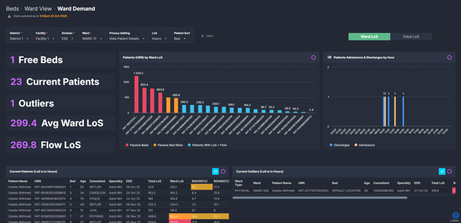
The summary tiles in this component provide a quick overview of your ward’s status:
- Free Beds: The number of unoccupied beds currently available.
- Current Patients: The number of patients currently occupying a bed.
- Outliers: Patients under your ward’s specialty but admitted elsewhere.
- Average Ward / Total LoS: The average stay of your current inpatients, viewed by ward or total hospital stay depending on the selected toggle.
- Flow LoS: The ideal LoS SystemView calculates for your ward to maintain steady patient flow.
There are also several interactive visualisations which provide deeper insight:
- Patients by LoS: Displays all current patients, colour-coded by Flow LoS category—Passive Beds (red), Passive Bed Risks (yellow), and Below Flow LoS (blue).
- Admissions and Discharges by Hour: Displays hourly ward activity, showing when admissions and discharges occurred to help identify peak flow times.
- Current Patients List: Displays patient-level detail, including bed number, consultant, specialty, Estimated Discharge Date (EDD), Total and Ward LoS, and RoH percentages for 30 and 60 days.
- Current Outliers List: Identifies patients under your ward’s specialty who are currently located elsewhere in the hospital.
How it works
The Ward Demand component combines near real-time bed data with SystemView's Flow LoS and RoH calculations to visualise how well the ward is managing throughput and patient turnover.
Calculation logic
- Flow Length of Stay (LoS): Represents the expected period of stay required for your ward to maintain optimal patient flow. It’s calculated using historical admission patterns and current capacity. Patients LoS are flagged with colours throughout the component:
- 🔴 Red = Passive Bed: Patient with a ward LoS at or more than double the Flow LoS.
- 🔶 Orange = Passive Bed Risk: Patient with a ward LoS above but less than double the Flow LoS.
- 🔵 Blue = Below Flow LoS: Patient with a ward LoS below the Flow LoS target.
🔗 Learn more about Flow LoS ›
- Risk of Hospitalisation (RoH): Predicts the likelihood that a patient will be readmitted within 30 or 60 days post-discharge. RoH flags appear in the patient lists:
- 🔴 Red = High risk of rehospitalisation
- 🌕 Yellow = Medium risk of rehospitalisation
🔗 Learn more about RoH ›
- Outlier: Refers to a patient under the care of your ward’s specialty but physically located in another ward.
How it helps you
- Manage bed pressure: See at a glance how many free beds remain and where patients may be staying beyond target timeframes.
- Plan ahead: Use hourly discharge data to forecast afternoon bed availability and admission capacity.
- Identify risks: Focus attention on patients with long stays or high readmission likelihood.
- Support safe discharges: Combine Flow LoS and RoH insights to prioritise discharge planning.
- Promote efficiency: Monitor real-time trends to reduce bottlenecks and improve patient flow.
Best practices
How often should I use it?
| What to do | How often | Who should do it | Why it helps |
| Review occupancy and outliers | Start of each shift | Nurse Unit Managers | Keeps staff aware of available capacity. |
| Monitor admissions and discharges by hour | Throughout the day | Flow Coordinators, Bed Managers | Identifies peak activity and turnover trends. |
| Check Flow LoS breaches | Daily | Ward Clinicians | Highlights long stays for review. |
| Sort patients by RoH or EDD | During discharge planning | Multidisciplinary teams | Prioritises high-risk discharges. |
Pair with these components
- 🔗 Ward View > Ward Overview: View occupancy and upcoming admissions alongside current patient flow.
- 🔗 Discharge Trends: Review historical discharge behaviour to identify timing patterns.
- 🔗 LoS Trends & Ward Dynamics: Understand how current LoS compares to long-term averages and Flow LoS performance.
- 🔗 Bed Capacity Monitor: Track how open bed numbers influence ward demand.
- 🔗 Inpatient Flow Monitor > Division Overview: See how your ward’s throughput fits within divisional performance.
💡 Tip: The Ward Demand component is perfect for building MyHub dashboards, combining tiles from other Beds components to visualise real-time occupancy, upcoming discharges, and capacity all in one place. See more about how to create a MyHub page ›
Tips for success
- Use Patient Sort to focus your analysis (e.g. by EDD to support discharge planning).
- Toggle between Ward LoS and Total LoS to view either current stay or full patient journey.
- Watch Flow LoS colours to identify patients staying longer than expected.
- Add Ward Demand to your MyHub dashboard for live visibility of ward flow and daily turnover.
Want a detailed breakdown?
If you’d like a more detailed look at every filter, chart, and tile in this component, you can download the Ward Demand Guide below.
📎 Download: Ward View > Ward Demand Guide
❓FAQs & Troubleshooting
Q. What’s the difference between Ward LoS and Flow LoS?
A. Ward LoS shows actual average stay duration for current inpatients. Flow LoS is the ideal target SystemView calculates to maintain patient flow and bed availability.
Q. What does 'Outlier' mean in this component?
A. An outlier is a patient who belongs to your ward’s specialty but is physically located in another ward. Monitoring outliers helps identify capacity issues and ensure continuity of care.
Q. Why would I switch between hours and days for length of stay?
A. Different wards manage patients on very different timeframes. Short-stay or same-day units (like MDUs or MAUs) benefit from viewing LoS in hours to track turnover within a single day. In contrast, inpatient or rehab wards gain more insight viewing LoS in days, where patients remain longer.
Use the LoS filter to choose the view that best matches your ward’s operational rhythm.