
Location in SystemView: SystemView > Explore > Emergency Department > POST Analysis
In this article:
What it is
The POST (Patient Off Stretcher Time) Analysis component provides insights into ambulance offload performance and related ED activity for the past 13 months.
It measures the time from ambulance arrival to when the patient is offloaded into an ED treatment space.
ℹ️ Note: Any time exceeding 30 minutes is considered a breach.
Why it matters
Monitor ambulance ramping and understand how ED capacity impacts patient transfers.
- Track ambulance arrivals and offload times.
- Identify patterns in offload delays across time of day or date.
- Visualise the relationship between ramping, ED occupancy and bed availability.
- Support collaboration between ambulance services and ED staff to reduce delays.
How to use it
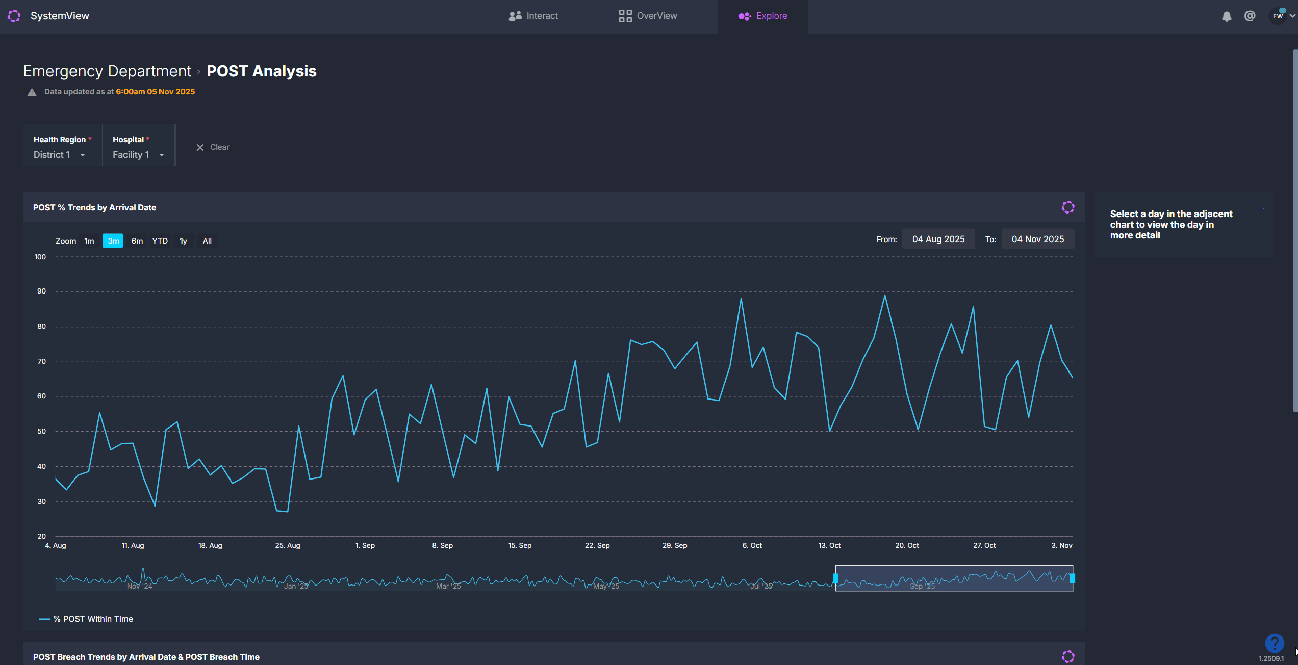
Explore key performance metrics
When you first open the component, you’ll see a 13-month overview of ambulance arrivals and POST performance. Clicking on any day within a trendline opens a detailed daily breakdown for that date.
Overview charts
| Chart name | What it shows |
| POST % Trends by Arrival Date | Displays the percentage of ambulance patients offloaded within 30 minutes for each day in the past 13 months. |
| POST Breach Trends by Arrival Date & POST Breach Time | Shows daily ambulance arrivals over 13 months, grouped and coloured by POST status: within time (under 30 mins), breached by 5 minutes or less (30–35 mins), and breached by more than 5 minutes (over 35 mins). |
Adjust your timeframe
Use the Zoom buttons at the top of the charts to quickly view a 1-month, 3-month, 6-month, year-to-date or full-year period. You can then:
- Move through time: Drag the scroll bar at the bottom of the chart left or right to shift the selected period backward or forward.
- Resize your view: Click and drag the edges of the scroll bar to expand or narrow the timeframe and focus on a larger or more specific date range.
- Select custom dates: Click the From and To date fields at the top of the chart to choose any date range from the past 13 months, such as a specific week, fortnight or known period of high activity.
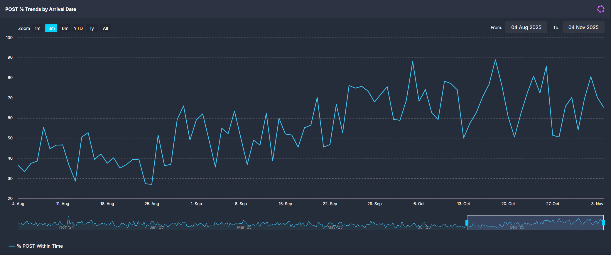
💡 Tip: Combine zoom, scroll and custom date selection to focus on any timeframe that best suits your analysis.
Daily breakdown view
Click any date in the overview charts to open detailed metrics for that day.
| Tile name | What it shows |
| POST Metrics | Summary of ambulance arrivals, POST breaches, POST within time, percentage POST and the maximum ramp wait time for the selected day. |
| Ambulance Arrivals & POST Breaches by Arrival Hour | Shows ambulance arrivals (blue trendline) and POST breaches (red columns) by hour of arrival. Each red column represents the number of patients offloaded after 30 minutes. |
| Maximum Time (min) Spent on Ramp Wait for POST by Ambulance Arrival Time | Breaks down total arrivals into three categories: within time (under 30 mins), breached by ≤5 mins (30–35 mins) and breached by >5 mins (over 35 mins). |
| Presentations by Arrival Hour | Displays total ED presentations per hour, including both walk-ins and ambulance arrivals. The chart includes average, upper and lower control limits based on historical data to identify surge hours. |
| Available Beds in ED | Shows the number of available treatment spaces in the ED at 1-hour intervals throughout the day, colour-coded by area. This helps identify whether ramping occurred due to limited capacity or bed block within specific ED areas. |
| POST Completed Rate | Displays the percentage of ambulance service records that have been closed and completed on the ambulance system side versus those still open. This helps identify data integrity issues. |
| Time from Arrival to Triage by POST | Groups ambulance arrivals by how long it took patients to be triaged after arriving at the ED (for example, 0–5 minutes, 6–10 minutes). Bars are coloured red for POST breaches (offloaded after 30 minutes) and blue for patients seen in time. This helps show whether longer offload times relate to slower triage. |
| Patients by Diagnosis & NEAT / ELOS / PET Status | Displays ED occupancy throughout the day at 30-minute intervals, colour-coded by area. Allows comparison between offload delays and departmental congestion. |
💡 Tip: These charts collectively help identify whether POST breaches relate to high ED occupancy, reduced bed availability or compressed ambulance arrival times.
Explore patient details
Click the Patients button to open a detailed list of all ambulance arrivals for the selected date.
This table includes patient demographics, ED triage category, POST time and the number of beds available in each ED area at the time and the list is sorted by longest POST time at the top, helping you quickly identify the most delayed cases.
Use these lists to support retrospective audits, clinical incident reviews, or escalation analysis. Data in these tables can be exported for further analysis. See How to export from SystemView ›.
💡 Tip: Use the Breach Status filter before clicking Patients to view only breached or seen-in-time arrivals.
How it works
POST Analysis compares the time between ambulance arrival and when the patient is offloaded to a clinical space.
- Breach threshold: Offloads over 30 minutes are breaches.
- Data sources: Metrics are derived primarily from the local ambulance service feed, except for charts showing general ED presentations, available beds and patient pathways, which use ED source data.
Calculation logic
- Expected presentations: derived from the average number of arrivals for the same day of week, hour, and season (for example, summer or winter) over the previous 2 years.
- POST % = (Number of patients offloaded within 30 minutes ÷ Total ambulance arrivals) × 100
How it helps you
- Monitor ramping performance: Identify daily and hourly patterns in offload times.
- Diagnose causes: Correlate breaches with ED congestion, bed availability or surges in arrivals.
- Collaborate with ambulance services: Support joint performance reviews and data validation.
- Identify system-level constraints: Highlight access block trends that impact ambulance turnaround.
Best practices
How often should I use it?
| What to Do | How Often | Who Should Do It | Why It Helps |
|---|---|---|---|
| Review daily POST % and breaches | Weekly |
ED Leadership, Nurse Managers | Monitor consistency in offload performance. |
| Investigate outlier days | As needed | Data Analysts, Flow Coordinators | Identify if breaches align with spikes in arrivals or low bed availability. |
| Review POST completion rate | Monthly | ED Directors, Quality Teams | Ensure ambulance source data integrity and accuracy of performance reports. |
Pair with these components
- 🔗 Department Now > Situation Report: View live ambulance activity and ramping events.
- 🔗 Flow Monitor > Historical Patient Flow: Replay patient movement on days with high ramping.
- 🔗 NEAT / ELOS / PET Analysis: Compare POST performance with time-to-admission outcomes.
- 🔗 Trends > Demand & Activity: Review POST trends alongside overall ED presentation volumes.
Tips for success
- A POST exceeding 30 minutes is a breach; aim for consistent improvement toward the <30-minute target.
- Use the Available Beds in ED and Patients in ED by Pathway & Time charts to understand capacity issues that may drive ramping.
- Activate › charts to view full-screen, export data, or add to Interact › dashboards.
- Regularly check the POST Completed Rate to ensure ambulance records are fully closed on your local ambulance service's side.
Want a detailed breakdown?
If you’d like a more detailed look at every filter, chart, and tile in this component, you can download the POST Analysis Guide below.
📎 Download: Emergency Department > POST Analysis Guide
❓FAQs
Q. What counts as a POST breach?
A. Any patient whose offload time exceeds 30 minutes from ambulance arrival is counted as a breach.
Q. Why is the POST completed rate chart showing below 100% for a particular day.
A. This occurs when some ambulance service records have not been closed in the source system. Follow up with your ambulance data team to resolve.
Q. Why do I see different numbers in the ED and ambulance systems?
A. SystemView combines data from both the ambulance service and the ED source systems using arrival times and patient details. Because of differences in how data is entered in each system, not every record can be perfectly matched. Unmatched records may show blank fields in the patient list or small count differences between systems.
Q. Why is there a blank fields in the patient list?
A. A blank field appears when an ambulance record couldn’t be fully matched to an ED record. This happens when the data entered in the two systems differs slightly.